It wasn’t until fairly recently that you could be fairly certain that most visitors to your destination website were viewing it on a computer with a reasonably sized screen and mouse and keyboard at their fingertips. However, with the rapid growth in technology and popularity of mobile devices that is no longer the case. Increasingly individuals are using their smart phones and tablets to access the web, and they are not just browsing either; a growing number of purchases are being made by people accessing the internet in this way. Analysts from Morgan Stanley predict, based on the current rate of change and adoption, the mobile web will be bigger than desktop Internet use by 2015. If your site is not mobile friendly, you could be missing out on significant traffic.
What does this mean for the travel sector?
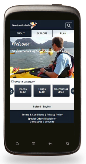
Perhaps more than any other sector, a large percentage of travel consumers are accessing information on the go. The very nature of travel means that people have a need for information when they are away from their desktop. For destinations, visitors are likely to be accessing the site for information and much of this will be of most relevance to them during their visit. They may be looking at things to do, local events, transport details or restaurant recommendations. It’s of increasing importance that this information can be delivered in a convenient and efficient way.
How should a mobile site be different from your main website?
While your website might render just fine on a mobile browser you can and should be offering a far improved experience with a dedicated mobile site. Visitors will be more likely to use, recommend and share your content if it is presented in an optimum way and users now expect their mobile experience to be as good as their desktop experience.
A few key differences to address:
1. Screen size
Perhaps the most obvious difference to address is that the screen size of mobile browsers differs vastly from the large widescreen monitors attached to most desktops. A normal website won’t display properly on the small screen, leaving visitors scrolling both horizontally and vertically, or having to zoom in to read tiny snippets of text. Make sure content can fit on the screen without pinching and zooming. A good design top is to use plenty of negative space to make it easy to focus on the message and avoid eye strain.
2. Loading time
Mobile browsing by its very nature tends to be slower, and coupled with data limits, users won’t thank you for large graphics that don’t display well on their handheld devices. While for most destination sites imagery is of key importance, the exception to this is on your mobile version which should be streamlined and stripped down. Using Analytics data you can tap into the data that mobile users are accessing most to present the most relevant information to them, preferably in bulleted form. In a 2011 survey by Compuware, 71% of users stated that they expect a mobile site to load as fast as a desktop site. Not meeting this expectation will cause a significant loss of traffic over time.
3. Take care with technology
Different mobile browsers will support different technologies and it is important to take this into consideration when developing your mobile site. For example, a flash based site won’t be too useful for iPhone users and some JavaScript elements perform poorly on mobiles.
4. Simplify navigation>
You may have to rethink your navigation system for your mobile website with a clear hierarchy in menus and no rollovers. Drop down menus might seem clean and convenient for your main site but are awkward for those using mobiles.
5. Think about input devices
Make sure your mobile website version can be operated with fingers, opposed to a keyboard and mouse! Pay attention to button sizes and make it easy to interact with for those using fingers and thumbs.
6.Take advantage of GPS
While your mobile site may be designed as a stripped down and streamlined version of your main website, there are additional features and technologies you can take advantage of. Perhaps the biggest is the ability to tap into the users GPS to serve up information about their location and relevant maps and directions.
7. Developing your mobile site
The details and processes of developing a separate mobile site are too complex to delve into within the scope of this article, however there are a few development notes worth mentioning:
Your developer should use a mobile site redirect code that automatically determines whether a visitor is using a mobile version of your site, delivering them the appropriate version. Users should be given the option somewhere to switch to the desktop version of your site should they wish.
HTML5 / CSS 3 are recommended for interactivity and animation.
Your site should be equally accessible when viewed in vertical or horizontal orientations. The main aspect of developing your mobile website will be your focus on content, refining text passages to bulleted lists, stripping out any padding and developing a focus on the core information.
8. App vs Mobile site
The question often arises as to whether developing a mobile app is better or advantageous over developing a mobile version of your website. The main difference is that a mobile website is similar to any other website, whereas an application is something downloaded and installed on your mobile device. When it comes to decide on which is most appropriate, the decision will largely rely on your end goals but fundamentally, if your purpose is to offer mobile-friendly information a mobile website should be your first step. A few advantages of a mobile website over an app include: – Sharing: The URL can be easily shared via social media, text message or email – Permanence: The website can’t be deleted by users. – Cost: Mobile websites are easier and more cost effective to produce and require less ongoing support and upgrades. – Reach: A mobile website will have a larger reach than an app, as users find the content via search engines or shared links. An app is not without its own advantages, primarily relating to interactivity and the ability to function without, or with only a very slow internet connection. However, in terms of return on investment most destinations would be advised to start their venture into the handheld market with a well optimised mobile website in the first instance.
About the guest blogger:
Kate Waite works for travel and digital marketing specialist Dot Tourism who provide a number of services to the travel trade including website development, email marketing and social media.